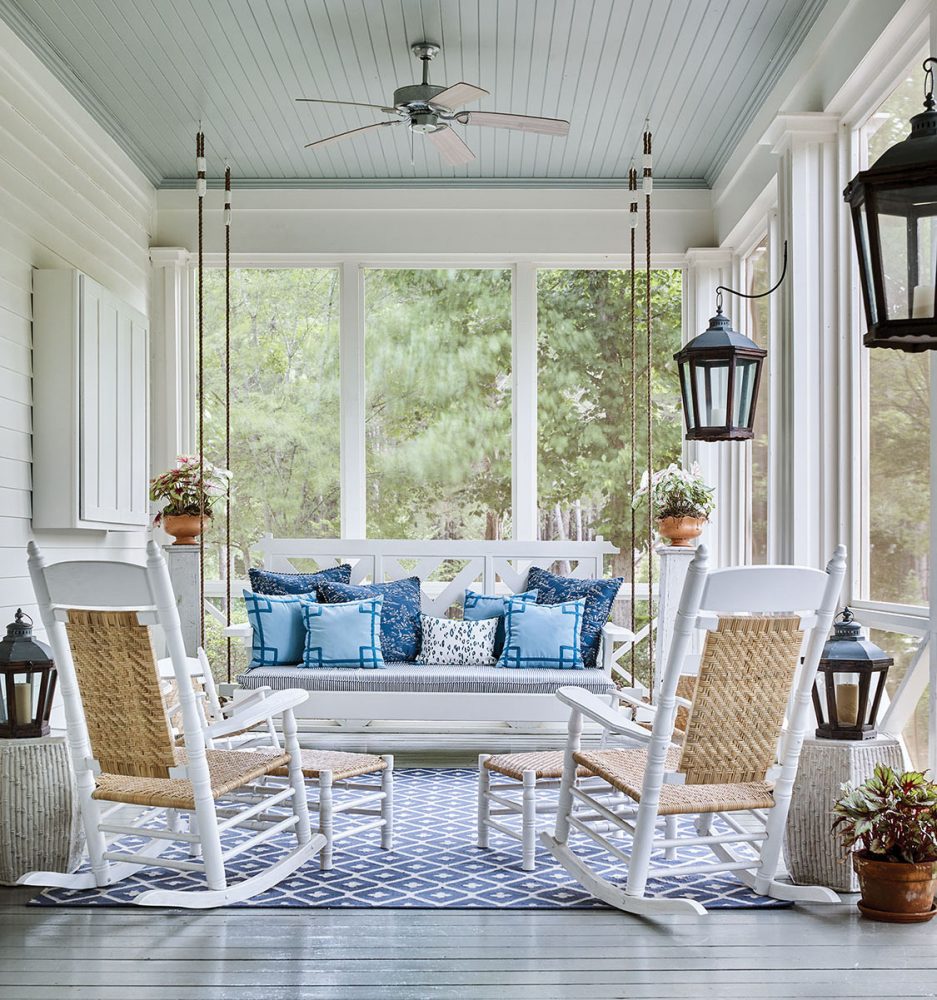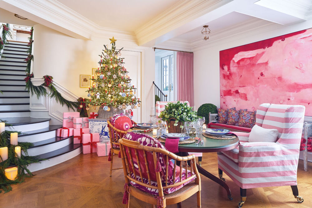
Wallpapers, fabrics, and trims in an array of patterns mix effortlessly when unified by the cohesive colorways in the Stroheim Color collection.
Color is making a comeback. Across the country, interior designers and design enthusiasts are fearlessly experimenting with textiles in bold hues and even bolder prints to wrap once-neutral rooms in visual and tactile interest. Judging from the curated, chic, and undoubtedly unique rooms filling magazine pages and flooding Instagram feeds, it looks like they’re mastering the mix. But the layering process can be baffling for many, so we’ve put together a few tips to help take out the guesswork.
FIND A FOUNDATION TO BUILD YOUR ROOM ON
Look for a fabric or wallcovering that speaks to your individual style, whether it’s a floral, chinoiserie, geometric, or ethnic-inspired print. The options are endless, so this will give you a solid start on the decorating process.
Get the look
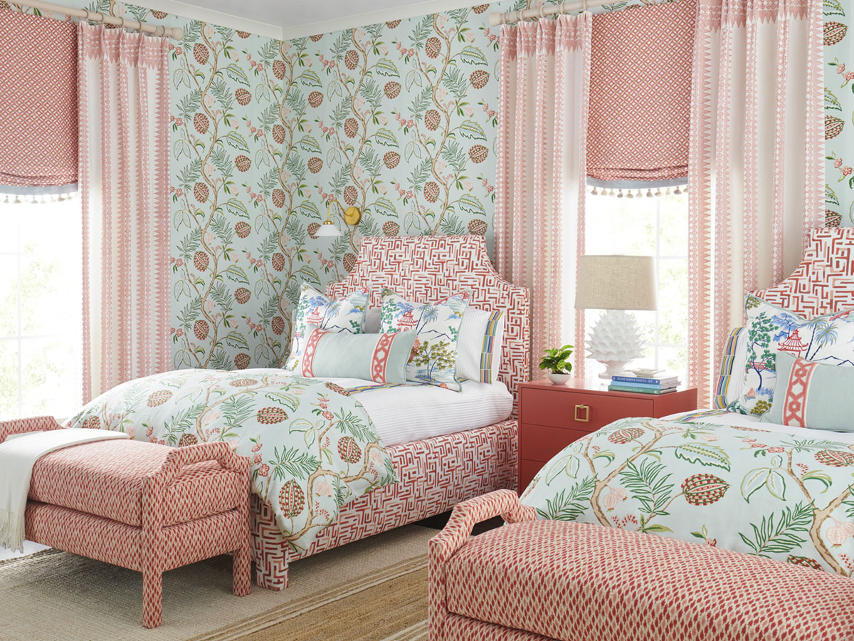
Inspired by a classic Jacobean print, the wallcovering’s exaggerated scale defies the delicate botanicals of centuries-passed while juicy hues invigorate the once prim-and-proper pastel palette.
Embroidered abstract trellis motifs on a pair of upholstered platform beds in Varanasi, benches in Ludhiana Flame, and Crewelworks wide tape trim—all in a coral palette—add to the variety of prints throughout the room.
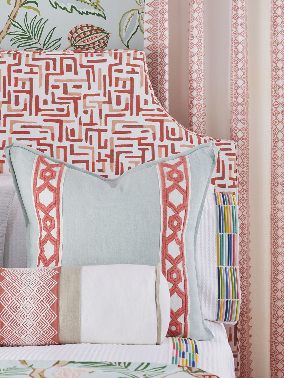
A note on throw pillows: After the foundation has been set, throw pillow options abound. In the first photo, the scenic print Kochi Toile pulls from the organic themes in the botanical wallpaper, while in the second photo, the bolster’s center panel of Algorithm mingles with the other geometric prints for a more tailored look.
ENHANCE THE FOUNDATION WITH ACCENT PATTERNS AND COLORS
Pull design motifs from the foundation and repeat them throughout the room to create interest and cohesion. Also, extract colors from the foundation and incorporate solids, textural fabrics, small-scale prints, and trims in those hues.
Get the look
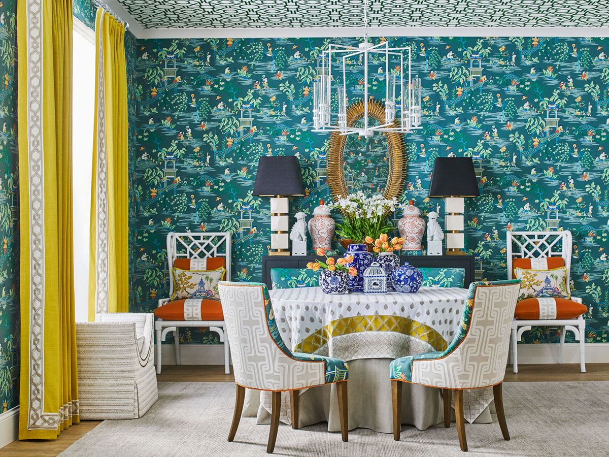
Cortina Linen drapes in Mustard with Crewelworks wide tape trim in Linen energize the moody blue-green palette of the dining room wrapped in Stroheim’s Tian Chinoiserie in Laurel.
On the ceiling, Cathay Trellis wallcovering in Laurel calls the eye up and heightens interest by adding something fun and unexpected to an otherwise blank space. The spunky graphic is a magnified version of the geometric motif on the footbridges and pagoda walls as well as the white lacquered Chinese Chippendale chairs that flank the sideboard.
The burnt-orange velvet on the chair cushions is also pulled from wallcovering and, like the drapes, brightens the room. A center stripe of Tezza trim in Linen balances the bold hue with a striking accent.

CREATE BALANCE
Incorporate prints in varying sizes and patterns to avoid overwhelming the room. It’s ok to use multiple fabrics or wallcoverings as long as the different elements complement one another.
Get the look
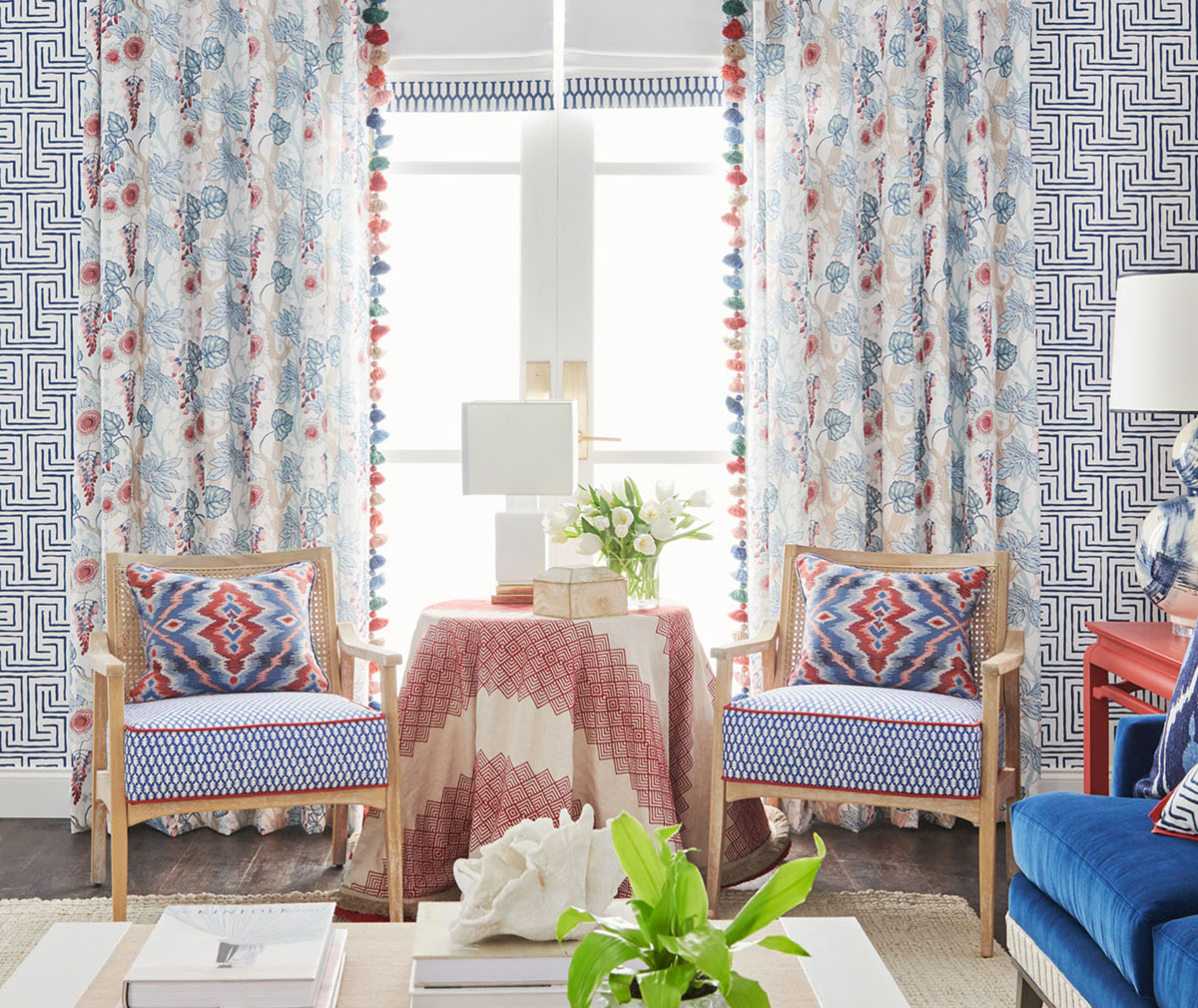
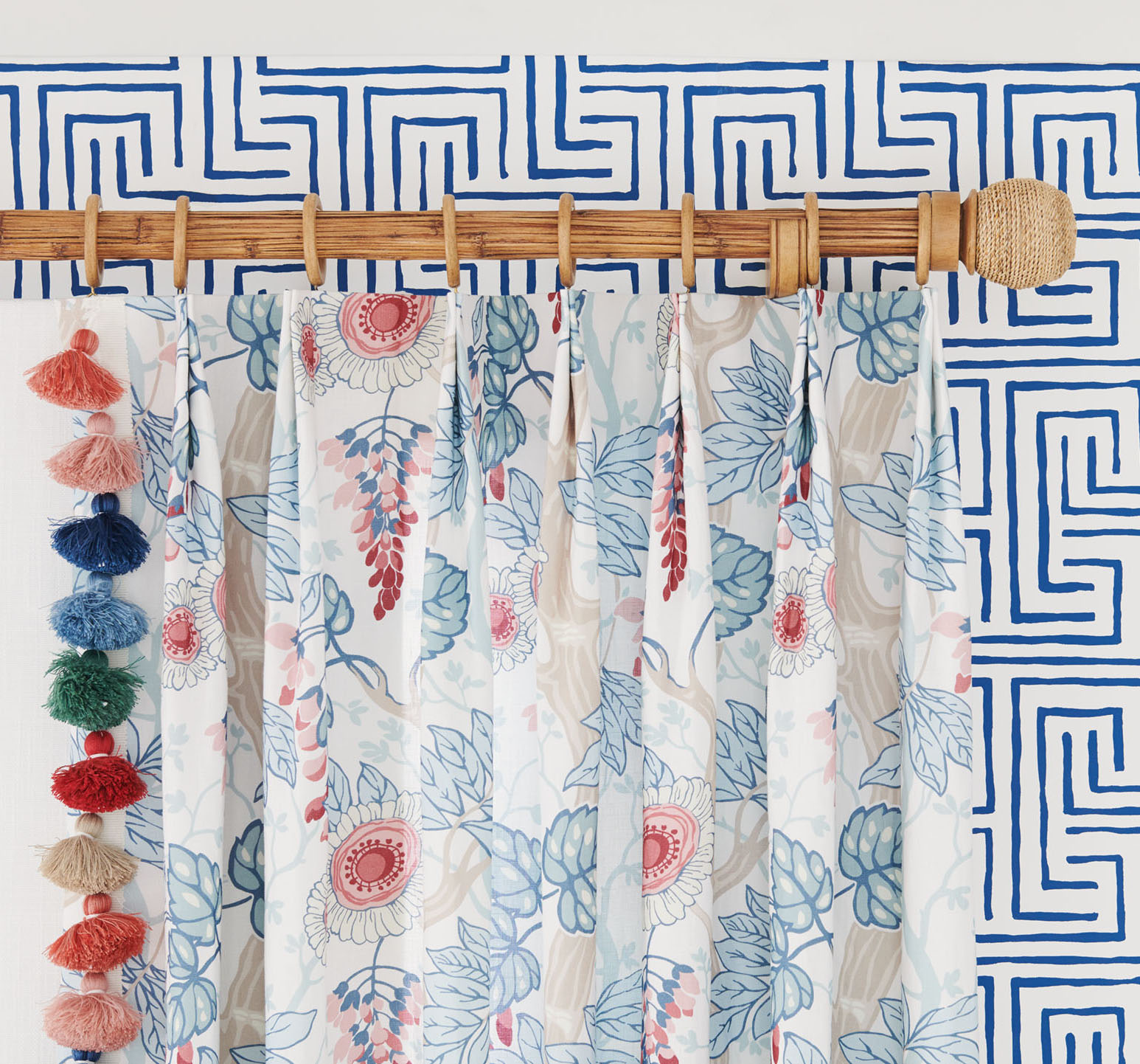
Large-scale and loosely-structured, Stroheim’s Avni Maze wallcovering in Navy reads as an abstract interpretation of the ancient Greek Key motif. Its straight-forward blue-and-white color combo makes the perfect backdrop for custom drapes in Isabella, a whimsical room-building floral.
Varying shades of red and blue put a current spin on the classic American color scheme while multi-colored Tabitha tassel trim incorporates another layer of color, texture, and depth into a living room.
COMPOSE A PALETTE
Don’t just layer prints, layer colors to create a bespoke palette. Use your foundation and accent selections to help guide the trim, artwork, lamp shades, and other room décor.
Maximum style, minimal effort. That’s what the new Stroheim Color collection is all about. Although the brand is widely known for its brilliant blues, it is looking at color through a whole new lens with the addition of three fresh and distinct color palettes comprised of floral, chinoiserie, and geometric print fabrics, trimmings, and wallcoverings as well as Crypton Home high-performance wovens. Mixing and matching has never been so easy. Color has never looked so chic.
Sponsored by Fabricut. Explore the Stroheim Color collection at fabricut.com
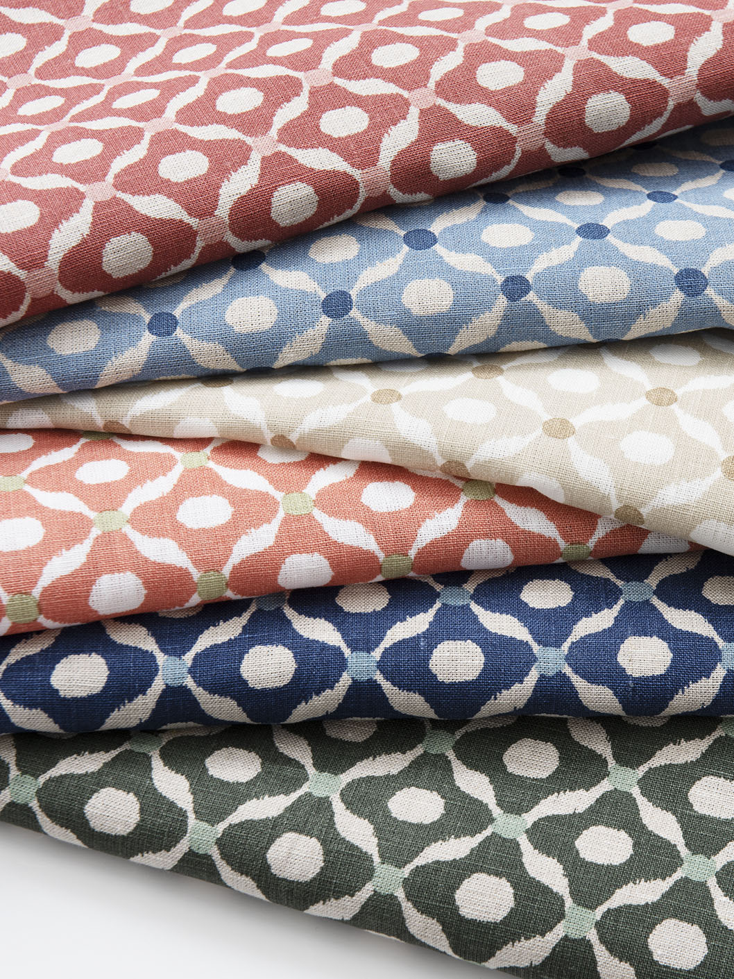
Chanderi in a spectrum of colors to complement any palette.
By Margaret Zainey Roux


