IS IT EVER A CHALLENGE TO CONVINCE CLIENTS THAT THEY WILL NEVER REGRET ACID GREEN (OR TEAL OR COCA-COLA BROWN)—AND, IN FACT, IT’S GOING TO BRING JOY EVERYDAY?
I’ve been very lucky. The people I work with trust me and it usually works out. However, I once convinced one of my favorite clients to paint his dining room in a citrine lacquer. He was skeptical, but agreed. When I arrived at the house for the installation and saw it for the first time, well, let’s just say it’s not something that could—or should—be described. I called right away and said, “I made a mistake. It’s going to take us two days to fix it, but I need to make it right.” We lacquered it white, and it was perfect.
YOU USE PREDOMINATELY CLASSIC ELEMENTS, BUT THEY ALWAYS HAVE A FRESH AND CURRENT FEEL. WHAT IS THE KEY TO SEEING TRADITIONAL PIECES IN A NEW WAY?
It’s in the combination. In an entry hall we used a Georgian architect’s table, an 18th-century Swedish settee, and prints in gilt frames. But we combined those with a faux tortoise Parsons table, a modern rug, and a painted grass cloth paper with a large diagonal stripe. The mix gave it a youthful edge.
With furniture, sometimes it’s necessary to see the piece’s potential and not its current state. I’ve encouraged clients to purchase antique chairs and settees with sprung seats and fraying fabric, and they start out incredulous. But if you can see the beauty of the shape and then reupholster, perhaps not in damask, but an ethnic print, you’ll see it in a whole new way.
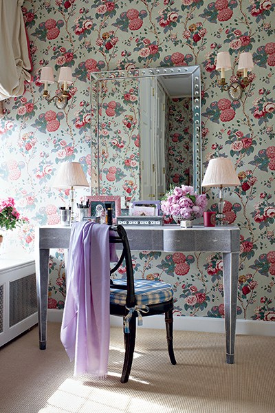
A lady’s dressing room calls for a feminine hydrangea and rose chintz by Clarence House. Photo by Christopher Baker
WE SPY LOTS OF FLORAL PRINTS USED ON WALLS, EVEN IN VERY SMALL SPACES, AND THEN DIFFERENT SCALE BOTANICALS ON FURNITURE, RUGS, AND ART. WHAT DO YOU THINK FLORALS BRING TO A ROOM, AND IS THERE EVER TOO MUCH?
In theory, I’d say no, there’s never too much. Nature has been an inspiration for textiles forever. Obviously the approach is different in little girls’ rooms than a bachelor’s apartment. For myself, I like using more masculine patterns. Husbands, too, can be more comfortable with bamboo or Tree of Life patterns in the bedroom. But florals are a great way to add pattern or color. And, the beauty is there are so many to choose from!
ONE OF OUR FAVORITE DESIGNS OF YOURS IS A LARGE, WHITE ROOM WITH A CRISP, GREEN AND WHITE CHINTZ. EVERYTHING FEELS SO AIRY, BUT UPON CLOSER STUDY THERE’S ACTUALLY A LOT OF FURNITURE. HOW DO YOU OPTIMIZE SEATING WITHOUT MAKING A SPACE LOOK LIKE A JUMBLE SALE?
That’s one of my favorites, too. It’s an old stable in Southampton and the room is square with a high ceiling. We painted the paneling white, and the background allows a lot of things to go on. The homeowners wanted to be able to entertain a lot of people, or also just hang out and watch a movie. The double-sided sofas and love seats provide a lot of seating without making the room seem crowded or cramped.
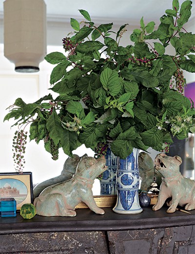
In his own house in upstate New York, Roberts uses greenery cut from the garden to fill an antique Chinese porcelain vase. Photo by Björn Wallander
You own houses in Port Townsend, Washington, and the Hudson River Valley in New York. Do you ever experiment with something at home before trying it on the job? Sometimes it happens the other way around. I’m not saying my clients are guinea pigs, but often I have an idea of something I want to try and I’ll have a chance to use it with someone else first, and then translate it to my own house later. Like most designers, my houses are sort of the cobbler’s children—they are the last things I tend to focus on!
All Photos courtesy of: The Vendome Press, From Markham Roberts Decorating The Way I See It (2014).
By Patricia O’Dell Shackelford


