[vc_row][vc_column][vc_single_image image=”242786″ img_size=”full” add_caption=”yes”][vc_column_text]
Q&A
Flower: Congratulations on 30+ years of Annie Sloan Chalk Paint! But let’s go back even further. Do you remember your first artistic effort or if you had a favorite crayon or finger paint in the box?
Annie Sloan: I was an only child and grew up on a small holding in rural Australia, so I indulged in a lot of creative pursuits to pass the time. I didn’t have a preferred medium, but whether I was choosing my own outfits, drawing, or painting, I was always drawn to bright, bold, Fauvist colors.
You went on to get a formal education in fine art. Are there any famous artists you studied who particularly influenced you?
Gaugin has been instrumental in my relationship with color. I’ve always been delighted with his tricks, such as painting beaches purple and the color clashing he used. I have a dusky purple color, Emile, named for his son. But I really do get inspiration from across cultures, continents, and centuries. I love modernist artists such as Paul Klee, but I’m also constantly looking to the classics to guide me. The Bloomsbury Group’s Charleston farmhouse would be my number one influence—an entire home devoted to experimentation in furniture painting and in blurring the line between fine art and the decorative arts.[/vc_column_text][vc_empty_space height=”16px”][vc_row_inner][vc_column_inner width=”1/2″][vc_single_image image=”242785″ img_size=”full”][vc_column_text css=”.vc_custom_1616457652652{margin-top: -10px !important;border-top-width: -10px !important;padding-top: -10px !important;}”]
Inspiration board for the color Lem Lem, a nod to the Ethiopian allium fields Annie saw on her travels.
[/vc_column_text][/vc_column_inner][vc_column_inner width=”1/2″][vc_single_image image=”242790″ img_size=”full”][vc_column_text css=”.vc_custom_1616457670965{margin-top: -10px !important;border-top-width: -10px !important;padding-top: -10px !important;}”]
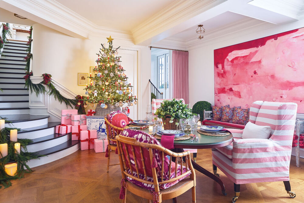
Annie Sloan Chalk Paint in Emperor’s Silk is paired with pale pink Antoinette to give the wall panels a modern vibe.
[/vc_column_text][/vc_column_inner][/vc_row_inner][vc_empty_space height=”16px”][vc_column_text]Please give us a little “Chalk Paint 101”—what makes it distinctive?
The quality of pigments—nothing is as important as depth and richness of color. It’s also water-based, which is not only environmentally friendly but also key for creating different textures and ensuring the paint dries quickly. We add binding ingredients to thicken the paint. This means fewer coats to get better coverage, and the ability to create those distressed looks, industrial textures, and velvety matte finishes for which we’re known.
We imagine your own interiors as a kaleidoscope of color. Do you use your house as a laboratory?
My home in Oxford, England, is my refuge and where I recharge with my husband. I use color psychology to zone rooms and paint accordingly. Our bedroom is the dark, jewel-toned Aubusson Blue, which I find deeply relaxing. The living room is Antoinette, a gentle pink that always gets compliments, quite often from men who are surprised to realize they like it! I’m a collector, and when I travel I bring home sculptures, paintings, and even furniture. Home is a patchwork of my travels and my life.
[/vc_column_text][vc_empty_space height=”16px”][vc_row_inner][vc_column_inner width=”1/2″][vc_single_image image=”242783″ img_size=”full” onclick=”custom_link” img_link_target=”_blank” link=”https://clone.flowermag.com/annie-sloan-diy-projects/”][vc_column_text css=”.vc_custom_1616458980446{margin-top: -10px !important;border-top-width: -10px !important;padding-top: -10px !important;}”]
[/vc_column_text][/vc_column_inner][vc_column_inner width=”1/2″][vc_single_image image=”242788″ img_size=”full”][vc_column_text css=”.vc_custom_1616457800774{margin-top: -10px !important;border-top-width: -10px !important;padding-top: -10px !important;}”]
[/vc_column_text][/vc_column_inner][/vc_row_inner][vc_empty_space height=”16px”][vc_column_text]Where do you travel for local color?
I love Scandinavia, despite the style being so different from my own. My trip to India last January was a lifelong dream come true and more beautiful, colorful, and inspiring than I could’ve imagined. I just appreciate that all these different places exist, and I like merging bits of them together to create something new.
The color Lem Lem was inspired by allium fields you saw in Ethiopia. Are there other ways flowers inform you?
I love folk art that celebrates regional botanicals and wildlife, and our stencil designs are heavily inspired by flora and fauna. We have Mexican Bird with tropical flowers; Chinoiserie Bird with East Asian foliage; and Meadow Flowers, which references the gorgeous delicate summer wildflowers of Port Meadow here in Oxford—think cow parsley, fritillaries, clover, and daisies.[/vc_column_text][vc_empty_space height=”16px”][vc_row_inner][vc_column_inner width=”1/2″][vc_single_image image=”242792″ img_size=”full”][vc_column_text css=”.vc_custom_1616458218000{margin-top: -10px !important;border-top-width: -10px !important;padding-top: -10px !important;}”]
[/vc_column_text][/vc_column_inner][vc_column_inner width=”1/2″][vc_single_image image=”242791″ img_size=”full”][vc_column_text css=”.vc_custom_1616458271645{margin-top: -10px !important;border-top-width: -10px !important;padding-top: -10px !important;}”]
Meadow Flowers stencil against a Napoleonic Blue background
[/vc_column_text][/vc_column_inner][/vc_row_inner][vc_empty_space height=”16px”][vc_column_text]You have passed along so much artistic knowledge through your books and tutorials. What’s the most memorable stylistic advice you’ve ever been given?
Bizarrely, it came from a doctor, back in the days when they made house calls. I was nursing a sick friend, and when the doctor arrived, he immediately said, “No wonder you’re ill. There’s no color in this house!” My friend was an artist, too, but everything she owned was white, down to the cutlery. We brought in vibrant flowers and accessories to liven the place up, and she recovered within days. Color is healthy; color is necessary!
[/vc_column_text][vc_empty_space height=”16px”][vc_row_inner][vc_column_inner width=”1/2″][vc_single_image image=”242789″ img_size=”full”][vc_column_text css=”.vc_custom_1616458399422{margin-top: -10px !important;border-top-width: -10px !important;padding-top: -10px !important;}”]
A painted runner in Emperor’s Silk and Honfleur
[/vc_column_text][/vc_column_inner][vc_column_inner width=”1/2″][vc_single_image image=”245641″ img_size=”full”][vc_column_text css=”.vc_custom_1616458787026{margin-top: -10px !important;border-top-width: -10px !important;padding-top: -10px !important;}”]
[/vc_column_text][/vc_column_inner][/vc_row_inner][vc_empty_space height=”16px”][vc_column_text]And finally, a question we always ask. If you were to choose a flower that best represents your personality, what would it be?
The bottlebrush! It’s brightly colored, very interesting, and some might say a little weird. Though native to Australia, it now thrives all over the world.[/vc_column_text][vc_empty_space height=”16px”][vc_row_inner][vc_column_inner width=”1/2″][vc_single_image image=”245643″ img_size=”full”][vc_column_text css=”.vc_custom_1616458657566{margin-top: -10px !important;border-top-width: -10px !important;padding-top: -10px !important;}”]
[/vc_column_text][/vc_column_inner][vc_column_inner width=”1/2″][vc_single_image image=”245642″ img_size=”full”][vc_column_text css=”.vc_custom_1616458570691{margin-top: -10px !important;border-top-width: -10px !important;padding-top: -10px !important;}”]
[/vc_column_text][/vc_column_inner][/vc_row_inner][vc_empty_space height=”16px”][/vc_column][vc_column][vc_separator border_width=”3″][/vc_column][/vc_row][vc_row][vc_column width=”1/2″][vc_column_text]By Karen Carroll | Photography courtesy of Annie Sloan, anniesloan.com
This story appears in Flower magazine’s Jan/Feb 2021 issue. Subscribe to the magazine or sign up for our free e-newsletter.[/vc_column_text][/vc_column][vc_column width=”1/2″][vc_single_image image=”242760″ img_size=”full” onclick=”custom_link” img_link_target=”_blank” link=”https://flowermagshop.com/collections/back-issues/products/jan-feb-2021″][/vc_column][/vc_row]


